TL;DR
White cabinets pair well with nearly any quartz countertop color, but the best choice depends on your cabinet’s undertone (warm or cool), your kitchen’s lighting, and your cabinet door style. The biggest trend in 2026 is a shift toward warmer quartz tones, with gold veined and Taj Mahal inspired patterns leading the way. Emerging colors like copper, terracotta, blue veined, and green veined quartz are also gaining traction for homeowners who want something distinctive. Before committing, always test a large quartz sample in your actual kitchen at different times of day.
Best Quartz Colors for White Cabinets: Quick Answer
The best quartz colors for white cabinets in 2026 are warm whites, Calacatta Gold style quartz, Taj Mahal inspired quartz, soft greige, and light taupe. Gold quartz and copper toned options are rising fast for anyone who wants warmth with personality. These colors complement both warm and cool white cabinets while adding depth without overpowering the space. The right choice depends on your cabinet undertone, kitchen lighting, and desired style.
| Kitchen Style | Best Quartz Colors |
|---|---|
| Modern minimalist | Pure white, light gray, cool white quartz |
| Transitional | Calacatta Gold, greige, warm white |
| Farmhouse | Cream, beige, Taj Mahal inspired quartz |
| Luxury contemporary | Gold veined quartz, dramatic marble look quartz |
| Earthy or organic modern | Copper quartz, terracotta quartz, brown quartz |
| Coastal or eclectic | Blue veined quartz, green veined quartz |
| Small kitchens | White, soft gray, light quartz colors |
| Dark floors | Warm beige, taupe, cream quartz |
The safest overall choice for most white kitchens in 2026 is a warm white quartz with subtle gold or taupe veining because it works across multiple cabinet styles, lighting conditions, and design trends.
Looking for help pairing quartz with your cabinets? Get a free design quote or browse real combinations in completed kitchens.
Why White Cabinets and Quartz Make Such a Versatile Pair
White cabinets make kitchens look bigger, cleaner, and more modern. Their real advantage, though, is versatility. Nearly any quartz color and pattern will pair beautifully with white cabinetry, which is why this combination dominates kitchen renovations year after year.
Quartz itself brings practical benefits that natural stone cannot match. As an engineered material, it is non porous, requires no sealing, resists stains, and delivers consistent color and pattern from slab to slab. You get the look of Calacatta marble or quartzite without the maintenance demands. For a deeper comparison, see the guide on quartz vs. granite countertops.
The real question is not whether white cabinets and quartz “work together.” They almost always do. The real question is which quartz color matches your style, your space, and your lighting.
Understanding Undertones Before You Choose a Color
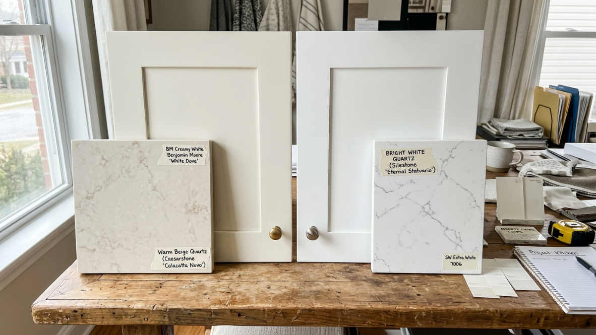
This is the section most design articles skip, and it is the one that matters most. Every white cabinet has an undertone, either warm (creamy, yellowish) or cool (blue gray, crisp). That undertone changes how any quartz countertop looks once it is installed.
The “Yellow Cast” Problem
Practitioners on Houzz forums repeatedly describe the same frustration: they install a bright, cool white quartz countertop, and suddenly their warm white cabinets look dingy or yellow. One Houzz user put it bluntly: “Yes, the quartz will make your cabinets look yellow. Go with the cool white and change the wall color.”
This happens because of adjacent surface contrast. Place a pure white quartz slab next to a creamy cabinet, and the eye registers the difference immediately. The cream reads as yellow by comparison.
Warm vs. Cool: A Simple Matching Framework
The fix is straightforward. Match the temperature of your quartz to the temperature of your cabinets, or contrast them deliberately with enough visual separation (like a dark backsplash between the two surfaces).
Popular white cabinet paint colors illustrate the spectrum. Benjamin Moore Chantilly Lace is about as pure and cool a white as you can get. Benjamin Moore Simply White leans warm. Sherwin-Williams Alabaster sits in between with a creamy softness. Knowing where your cabinets fall on this spectrum is the first step toward choosing the right quartz.
How Lighting Changes Everything
Natural sunlight enhances warm tones, while artificial LED lighting makes cool whites pop. This means the same quartz slab can read differently depending on your kitchen’s light sources and window orientation. One Houzz commenter noted that her northwest facing kitchen had limited natural light, making a creamy quartz look “too dingy” against her white cabinets.
If you are in the Pacific Northwest, where winter daylight is low and often overcast, warmer quartz tones tend to compensate for the limited light rather than fighting against it. Understanding how your framed vs. frameless cabinets reflect and absorb light is also worth considering when making this decision.
The best advice from designers: choose your quartz first, then let that guide your paint color and secondary decisions. Get the largest sample possible and view it in your kitchen at different times of day.
Best Quartz Colors for Popular White Cabinet Paint Colors
White cabinets are not all the same. The best quartz choice depends heavily on the specific white paint color.
| Cabinet Color | Undertone | Best Quartz Choices |
|---|---|---|
| Benjamin Moore Chantilly Lace | Cool white | Pure white, soft gray, Carrara style quartz |
| Benjamin Moore Simply White | Warm white | Cream, Taj Mahal inspired, Calacatta Gold |
| Sherwin-Williams Alabaster | Warm creamy white | Beige, greige, warm white quartz |
| Sherwin-Williams Pure White | Neutral white | Almost any quartz, especially marble look |
Glossary of Quartz Color Families for White Cabinets
A. Pure White Quartz
A pure white quartz countertop creates a clean, monochromatic look when paired with white cabinets. It maximizes light reflection, which makes it a strong choice for small kitchens or minimalist designs. The downside is excessive brightness. Without contrast from other elements, the kitchen can feel flat or sterile. If you go this route, lean on texture elsewhere: a dimensional backsplash tile, wood flooring, or matte black hardware breaks up the white and gives the eye something to land on.
Best for: Small kitchens, minimalist aesthetics, spaces that need maximum brightness.
Caution: Needs deliberate contrast in hardware, backsplash, or flooring to avoid looking washed out.
B. White Quartz with Veining (Calacatta and Carrara Looks)
This is the single most popular countertop category heading into 2026. A warm white base with subtle gray, gold, or taupe veining mimics the appearance of Calacatta or Carrara marble without the sealing and etching concerns. For a full comparison of real marble versus quartz, the quartz vs. marble guide breaks down the practical differences.
The distinction between the two marble looks matters. Calacatta style quartz features bolder, more dramatic veining that creates a focal point, especially on a large island. Carrara style quartz has finer, more delicate veining that reads quieter and works better in kitchens with a lot of other visual activity.
In 2026, the veining preference is shifting. Subtle, light gray veining continues to dominate, but gold and taupe veining are gaining ground fast. Homeowners are choosing softer movement that feels natural and understated rather than bold, dramatic patterns.
Best for: Transitional and classic kitchens, waterfall islands, anyone who loves the marble look without the maintenance.
Caution: Thick, dramatic veining can overwhelm flat panel cabinet doors (more on this below).
C. Off White and Cream Quartz
The all white kitchen is not going anywhere, but it is growing up. Stark, sterile white is fading in favor of whites with warmth, depth, and character. Off white and cream quartz countertops represent this evolution. They soften the space and pair naturally with warm white cabinets, reducing the risk of that undertone clash described above.
These tones have been rising steadily as the broader design world shifts toward warmer palettes. If your cabinets lean toward Sherwin-Williams Alabaster or similar creamy whites, an off white quartz will feel cohesive rather than jarring.
Best for: Warm white cabinets, farmhouse style kitchens, anyone avoiding the undertone mismatch problem.
Caution: In a kitchen with very little natural light, cream on cream can feel dim. Add warm toned under cabinet lighting to compensate.
D. Gray Quartz
Gray quartz with white cabinetry is one of the most reliable combinations in kitchen design. Light gray countertops keep the room bright while adding enough contrast to define the surfaces. Dark gray or charcoal quartz pushes the kitchen toward a more modern, industrial feel.
The range within gray is enormous. Warm grays with taupe undertones feel inviting. Cool grays with blue undertones feel sleek. The same warm versus cool matching logic applies here: a cool gray on cool white cabinets can feel cold and clinical, so consider warm grays if your cabinets are on the cooler side.
Best for: Contemporary and modern kitchens, homeowners who want contrast without going dark.
Caution: Cool gray quartz plus cool white cabinets plus gray tile flooring can create an unintentionally icy atmosphere. Break it up with warm wood or brass accents.
E. Beige, Taupe, and Greige Quartz
Beige was dismissed as “boring” for years, but it is firmly back, rebranded as “warm neutral,” “sand,” or “mushroom.” These tones feel organic and grounded, pairing naturally with wood accents, warm metals, and earth toned interiors.
Greige (the gray beige hybrid) is particularly useful because it bridges modern and traditional. It reads as neutral without leaning too warm or too cool, making it forgiving across different lighting conditions.
Best for: Transitional kitchens with mixed wood tones, spaces with honey colored hardwood floors.
Caution: Very yellow toned beige can clash with cool white cabinets. Stick to true taupe or greige if your cabinets are on the cooler side.
F. Gold Quartz
Gold quartz is the breakout neutral of 2026. Not metallic or glittery, but a warm, honey toned base (sometimes with deeper amber veining) that adds richness without shouting. Pinterest data shows that searches for golden countertop tones surged roughly 40% year over year, and quartz manufacturers have responded with expanded gold palette options.
The appeal is straightforward. Gold quartz brings the same warmth as brass hardware and oak cabinetry, creating an instant “collected” feel when paired with white cabinets. It reads luxurious without the formality of Calacatta Gold, which leans more marble inspired. Think of gold quartz as the casual, everyday sibling of a gold veined marble look.
Practitioners on Reddit’s r/HomeImprovement and r/InteriorDesign boards frequently recommend gold toned quartz for kitchens that get a lot of warm afternoon light, noting that the color “glows” in western exposure rooms. In cooler, north facing spaces, it compensates for flat gray daylight and keeps the kitchen from feeling sterile.
Best for: Warm white cabinets, kitchens with brass or unlacquered brass hardware, west facing rooms.
Caution: If your cabinets are a sharp, cool white (like Benjamin Moore Chantilly Lace), a strongly gold quartz can look out of place. Choose a softer gold with taupe undertones to bridge the temperature gap, or test a sample side by side with your cabinet door first.
G. Copper Quartz
Copper toned quartz is newer to the market and still a niche pick, but it is turning heads in showrooms. The color sits between brown and rose gold, with warm, burnished undertones that feel earthy and sophisticated at the same time. Some slabs feature subtle copper flecks or veining against a cream or warm white base, while others present a more uniform terracotta blush.
This color works best in kitchens designed around a full warm material palette: think white oak floors, warm white cabinets, and copper or aged bronze fixtures. It also pairs well with terracotta tile backsplashes and matte finishes.
Several designers on YouTube kitchen walkthroughs have pointed out that copper quartz functions as a “statement neutral,” something that reads bold in photos but lives quietly in person. That makes it a strong candidate for homeowners who want personality in their countertop without committing to a true bold color like navy or emerald.
Best for: Organic modern kitchens, homes with copper or bronze fixtures, warm white cabinets.
Caution: Copper quartz has a narrow color palette to coordinate with. Cool toned backsplashes, blue grays, or chrome hardware can fight it. Commit to warm metals and warm wall colors throughout the room.
H. Terracotta Quartz
Terracotta quartz takes the warmth trend even further, offering an earthy, sun baked quality that channels Mediterranean and desert inspired design. This is not a countertop that blends into the background. It has a distinct presence, somewhere between rust and warm clay, that grounds a white kitchen and prevents it from feeling generic.
The trend ties directly to what Architectural Digest has reported as one of the biggest shifts in kitchen design for 2025 and beyond: a move away from all gray and all white interiors toward colors inspired by natural earth and handmade textures. Terracotta fits squarely into that movement.
Terracotta quartz pairs best with cream or warm white cabinets. Cool white cabinets create too much temperature contrast, making the countertop look like it belongs in a different room. Keep the rest of the palette grounded: warm wood shelving, linen textiles, and matte finishes all support the look.
Best for: Mediterranean, Spanish revival, organic modern, or desert inspired kitchens. Homeowners ready for a distinctive countertop.
Caution: This is a committed choice. Terracotta quartz limits your future design flexibility more than neutral tones. Make sure you love it in your space, not just on a screen, before ordering.
I. Brown Quartz
Brown quartz adds warmth that keeps white cabinets from appearing dull or cold. It creates obvious contrast without the starkness of black, and it fits wonderfully into rustic, farmhouse, and transitional styles. Brown pairs well with wood flooring and natural fiber textiles, creating a grounded, organic feel.
Best for: Rustic, farmhouse, and eco themed kitchens. Homes with lots of natural wood.
Caution: Dark brown in a small, poorly lit kitchen can make the space feel closed in. Reserve deeper browns for larger kitchens or well lit spaces.
J. Black Quartz
Black quartz with white cabinets is timeless. It delivers maximum contrast and a bold, grounded look that works with virtually any appliance finish, from stainless steel to matte black. The combination has remained popular for decades and shows no signs of falling out of favor.
There is a practical trade off: black surfaces show dust, crumbs, and water spots more than lighter colors. This is not a durability issue (quartz cleans easily with mild soap and water), but it does mean more frequent wiping.
Best for: Large kitchens, dramatic design statements, anyone who values high contrast.
Caution: In small kitchens, black countertops can feel heavy. Balance with lighter flooring and a bright backsplash.
K. Blue Veined Quartz
Blue veined quartz pairs a white or light gray base with veining in slate blue, navy, or soft periwinkle tones. It is a more restrained way to introduce color than a fully blue countertop, and it works surprisingly well with white cabinets because the white base keeps things cohesive.
Interest in blue veined quartz has grown alongside the broader coastal and transitional kitchen trend. Caesarstone’s trend reporting has highlighted blue and ocean toned surfaces as a growing category, and several quartz brands now offer blue veined options that mimic the look of natural blue marble or sodalite.
On Reddit’s r/kitchendesign, homeowners who installed blue veined quartz with white Shaker cabinets report that it reads as “subtle and interesting” in person, even though it looks dramatic in slab photos. The veining acts like an accent color, adding depth without requiring a full commitment to a blue kitchen.
Best for: Coastal kitchens, transitional spaces, anyone who wants color without overwhelming the room.
Caution: Blue veining can clash with warm toned backsplashes or flooring. Keep the surrounding palette cool or neutral to let the veining shine.
L. Green Veined Quartz
Green veined quartz is having a genuine moment. Google Trends data shows searches for green quartz countertops climbing steadily since late 2024, and brands like Cambria and Silestone have expanded their green veined offerings in response. The look typically features a white or cream base with veining in sage, forest, or emerald tones, evoking natural stones like Verde Alpi marble or green onyx.
White cabinets are the ideal companion for green veined quartz because they let the color be the star without competing for attention. The combination has a fresh, nature inspired quality that feels current without being gimmicky.
One interior designer shared in a YouTube kitchen reveal that green veined quartz is “the new Calacatta” for clients who want something distinctive. That may be a stretch, but the trajectory is real. Green veining works across multiple styles: modern farmhouse with sage tones, Art Deco inspired kitchens with deeper emerald, or Scandinavian spaces with muted olive.
Best for: Design forward kitchens, nature inspired palettes, homeowners who want a unique focal point without going fully bold.
Caution: Green veined quartz locks you into a specific palette. Warm metals (brass, gold) tend to complement it better than chrome or brushed nickel. Plan your hardware and backsplash accordingly.
M. Gold Veined and Taj Mahal Inspired Quartz (2026 Trend)
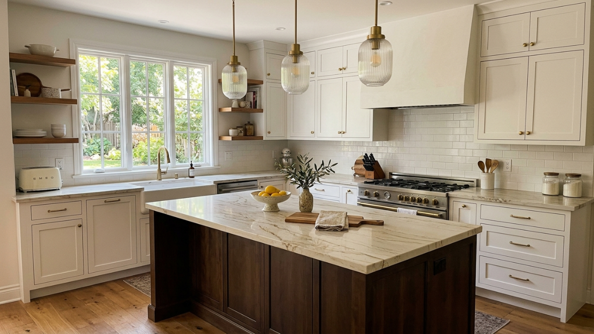
This is the breakout quartz category for 2026. The Taj Mahal quartzite look, featuring a cream or ivory base with soft gold and honey veining, has moved from niche to mainstream. Quartz manufacturers have captured this pattern in engineered form, giving homeowners the look without the cost and maintenance of natural quartzite.
The appeal is the soft, feathered texture that fits perfectly with the broader warm neutrals trend. These slabs pair beautifully with brass or gold hardware, warm white cabinets, and wood accents.
Best for: Warm toned kitchens, anyone drawn to brass or gold hardware, homeowners who want a current but not trendy look.
Caution: If your cabinets are a very cool, blue toned white, gold veining may create a noticeable temperature clash. Test a sample first.
Planning a kitchen remodel? Understanding the full timeline phase by phase helps you coordinate cabinet and countertop decisions without costly delays.
Quartz Colors for White Cabinets Comparison Chart
| Quartz Color | Overall Look | Advantages | Potential Problems |
|---|---|---|---|
| Pure White | Clean and modern | Makes kitchens brighter | Can feel sterile |
| Calacatta Gold | Luxury marble look | High resale appeal | Needs careful matching |
| Taj Mahal Inspired | Warm natural stone style | Current 2026 trend | Can clash with cool whites |
| Gold | Warm, honey toned neutral | Glows in natural light | Too warm for sharp cool whites |
| Copper | Burnished earthy warmth | Statement neutral | Narrow coordination palette |
| Terracotta | Sun baked, Mediterranean | Distinctive and grounded | Limits future flexibility |
| Gray | Contemporary | Adds contrast | May feel cold |
| Greige | Balanced neutral | Works with many styles | Avoid overly muddy tones |
| Beige/Cream | Warm and inviting | Great with wood tones | Can look dated if too yellow |
| Brown | Organic and earthy | Adds warmth | Dark shades shrink small kitchens |
| Black | Dramatic contrast | Timeless statement | Shows dust easily |
| Blue Veined | Coastal, fresh | Subtle color interest | Clashes with warm backsplashes |
| Green Veined | Nature inspired | Unique personality | Less flexible, locks in palette |
Best Quartz Colors for White Cabinets Ranked (2026)
Not every quartz color performs equally well with white cabinets. The following ranking considers design longevity, resale appeal, versatility, and how well each color handles different lighting conditions.
| Rank | Quartz Color | Why It Works | Best Cabinet Match |
|---|---|---|---|
| 1 | Warm White With Gold Veining | Current luxury trend, timeless, adds warmth | Simply White, Alabaster |
| 2 | Taj Mahal Inspired Quartz | Natural stone look without maintenance | Creamy whites |
| 3 | Soft Greige Quartz | Flexible neutral that works everywhere | Cool and warm whites |
| 4 | Calacatta Gold Quartz | High end marble appearance | Transitional kitchens |
| 5 | Gold Quartz | Warm, honey toned, rising fast | Warm whites, west facing rooms |
| 6 | Light Gray Quartz | Adds subtle contrast | Pure white cabinets |
| 7 | Cream Quartz | Creates a soft, inviting kitchen | Warm whites |
| 8 | Green Veined Quartz | Nature inspired standout | Design forward homes |
| 9 | Black Quartz | Dramatic contrast | Large kitchens |
| 10 | Copper / Terracotta Quartz | Earthy warmth, organic modern | Warm, committed palettes |
| 11 | Blue Veined Quartz | Coastal personality | Cool or neutral whites |
| 12 | Bold Solid Colors | Unique statement option | Design focused homes |
How Cabinet Door Style Affects Your Quartz Choice
This is a consideration most people overlook, and it makes a real difference in how the finished kitchen reads.
Shaker Cabinets
White Shaker cabinets are the most specified cabinet style in North American kitchen renovations. The five piece door with a recessed center panel has enough visual structure to pair with literally any quartz color or veining pattern. Shaker is the safest, most flexible option. The guide to framed cabinet quality covers what to look for in this classic style.
Flat Panel and Frameless Cabinets
Flat panel (slab) doors have minimal visual activity on the cabinet face. That means the countertop becomes the dominant surface in the kitchen. A busy, heavy veined quartz can overwhelm flat panel doors because there is nothing on the cabinet to balance the pattern. Choose quartz with restrained or subtle veining for frameless cabinets.
Raised Panel Cabinets
Raised panel doors already have visual complexity: profiles, contours, shadow lines. Pairing them with bold, heavily veined quartz creates too much competing activity. The result often feels fussy. Keep the quartz veining subtle and let the cabinet millwork do the talking.
The general rule: match the visual complexity of your countertop to the visual complexity of your cabinet doors. Simple doors can handle bolder stone. Detailed doors call for quieter stone.
Common Quartz Color Mistakes With White Cabinets
Choosing a quartz countertop is a long term decision, and small color mistakes can dramatically change the appearance of your kitchen. Avoiding these common kitchen remodel mistakes saves money and frustration.
Choosing Bright White Quartz With Cream Cabinets
One of the most common mistakes is pairing a cool, pure white quartz countertop with warm white cabinetry. The countertop can make the cabinets appear more yellow or outdated because the warmer undertone becomes more noticeable.
Better approach: Match warm cabinets with warm quartz or create intentional contrast using darker elements.
Ignoring Natural Lighting
Quartz colors change throughout the day. A slab that looks perfect in a showroom with bright lighting may appear completely different in a kitchen with northern exposure or limited sunlight.
Better approach: Test samples near your cabinets, flooring, backsplash, and lighting sources.
Selecting Busy Veining Without Considering Cabinet Style
Large dramatic veins can become overwhelming when paired with detailed cabinet doors.
Better approach:
- Simple shaker cabinets can handle stronger quartz patterns.
- Flat panel cabinets pair better with subtle movement.
- Raised panel cabinets work best with quieter countertops.
Following Trends Instead of Your Home
Gold veined quartz and warm neutrals are popular in 2026, but the best countertop is the one that works with your existing floors, lighting, and cabinet undertones.
Going Bold Without a Coordination Plan
Copper, terracotta, blue veined, and green veined quartz are all exciting options. But each one narrows your backsplash and hardware choices significantly. Practitioners on Reddit’s r/HomeImprovement frequently warn that bold countertop picks made in isolation (without considering the full room palette) lead to regret. Always mock up the full material board before ordering.
Choosing Quartz by Kitchen Size and Lighting
The size and layout of your kitchen dictate how bold you can go with color. In smaller kitchens, lighter quartz hues open up the space and prevent it from feeling cramped. Earthy colors like copper or terracotta can work in compact kitchens if the tones stay light and the cabinets are bright white, but darker versions of these colors are best reserved for larger rooms. In larger kitchens, you have more freedom to experiment with darker or bolder countertop colors.
Lighting works in tandem with size. If your floors feature rich, honey colored woods, a warm countertop (gold, cream, or copper toned quartz) will create harmony. Cool gray tile or dark hardwood pairs better with brilliant white surfaces. Let your desired atmosphere guide the decision. Warm hues create an inviting, communal feel. Cool hues feel sleek and energizing.
For homeowners in the Seattle and Tacoma area, the Pacific Northwest factor is worth noting. North facing kitchens in this region get limited direct sunlight, especially from October through March. That muted, overcast light tends to flatten cool tones and make them feel gray. Warmer quartz colors (cream, gold veined, taupe, copper) often look better in these conditions than stark cool whites.
If you are planning a kitchen project in Washington, understanding cabinet costs in the region can help you budget for both cabinets and countertops together.
Prefab vs. Slab: How Format Affects Your Color Options
Not every quartz color is available in every format. This is a practical detail that catches people off guard.
Prefab quartz comes in pre cut sizes with a narrower color and pattern range. The trade off is faster turnaround and lower cost. If you want one of the popular marble look whites or a standard gray, prefab will likely have it. But trending patterns like Taj Mahal inspired gold veining, copper tones, terracotta, or specific blue and green veined options are almost always slab only.
Slab quartz offers the full color range from any manufacturer, custom sizing, and more pattern options. If a specific veining pattern or 2026 trending color is important to you, slab gives more flexibility.
The comparison of prefab vs. slab quartz covers the cost, sizing, and seam differences in detail.
Backsplash and Hardware Coordination
Once you have settled on a quartz color, the backsplash and hardware pull the whole design together.
For white on white schemes (white cabinets, white or off white quartz), a textured backsplash tile prevents the space from feeling like one shapeless wall of white. Subway tile with a handmade finish, zellige, or a subtle geometric pattern adds dimension without introducing competing color.
For bolder quartz choices (copper, terracotta, blue veined, or green veined), keep the backsplash simple. A white or cream field tile lets the countertop be the focal point. Busy backsplash patterns competing with colorful veining creates visual noise that tires the eye.
Hardware metals should echo the quartz undertone. Gold veined or gold quartz looks best with brass or brushed gold pulls. Cool gray or blue veined quartz pairs naturally with brushed nickel or chrome. Copper quartz pairs beautifully with aged bronze or copper fixtures. Black quartz gives you the most hardware flexibility since black is a true neutral.
2026 Trend Snapshot: Where Quartz Colors Are Heading
The overarching direction for 2026 is warmth. While neutrals still dominate the quartz color story, the tone is moving from cooler grays and stark whites toward warmer hues. This shift mirrors what has been happening throughout home interiors for the past few years. Countertop manufacturers report larger appetite for colors like butterscotch, caramel, and cream, along with growing interest in earth inspired tones like terracotta and copper.
Five specific trends stand out:
- Gold veining over gray veining. Calacatta Gold style quartz is outselling Calacatta Cool for the first time in many markets.
- Taj Mahal inspired patterns. The soft, feathered texture with warm undertones fits perfectly with the broader warm neutrals movement.
- Subtle over dramatic. Homeowners are choosing softer veining movement that adds character without overwhelming the space.
- Earth tones entering the mainstream. Copper and terracotta quartz, once considered too adventurous for kitchens, are showing up in more designer kitchen reveals and showrooms. They represent the next step beyond gold for homeowners who want warmth with more personality.
- Color through veining, not solid slabs. Blue veined and green veined quartz allow homeowners to introduce color in a controlled way. The white or cream base keeps the countertop grounded, while the colored veining adds interest. This approach feels less risky than a fully colored slab and works better with white cabinetry.
White quartz is not going away. It remains the number one color family. But the shade of white that sells best has changed. Pure, cool white is giving ground to warm whites with depth and tonal variation.
Frequently Asked Questions
What is the most popular quartz color for white cabinets in 2026?
White quartz with subtle warm veining (Calacatta Gold style or Taj Mahal inspired) is the leading choice. The trend favors soft gold or taupe veining over the cool gray veining that dominated previous years. Gold quartz as a standalone color family is also rising quickly.
Can you pair white quartz with white cabinets without it looking too plain?
Yes, but you need to add texture and contrast elsewhere. A dimensional backsplash, dark or warm toned hardware, wood flooring, and varied lighting all prevent the monochromatic look from falling flat.
Does quartz make white cabinets look yellow?
It can if there is an undertone mismatch. A bright, cool white quartz placed next to warm or creamy white cabinets will make those cabinets appear yellowish by contrast. The fix is to match the quartz temperature to the cabinet temperature, or test large samples in your actual kitchen before committing.
What quartz color hides crumbs and stains best?
Mid toned quartz with veining or speckle patterns (light gray, beige, greige) is the most forgiving. Pure white shows coffee rings and dark crumbs. Black shows dust, water spots, and light crumbs. Patterned mid tones disguise everyday kitchen mess better than solid colors. Copper and terracotta tones are also quite forgiving because their warm, mottled appearance masks minor spills.
Is copper or terracotta quartz too trendy to be safe?
These colors are newer and do carry more design risk than white, gray, or beige. That said, earth tones have a long history in kitchen design (think Tuscan kitchens of the early 2000s, but updated with cleaner lines). The key is ensuring you genuinely love the color in your space, not just in magazine photos. Live with a sample for several days before ordering.
How does blue or green veined quartz hold up to resale?
Blue and green veined quartz is more niche than neutral options, which means it appeals to fewer buyers at resale. If resale value is a top concern, a warm white with gold or gray veining is the safer bet. If the kitchen is for your own enjoyment and you plan to stay in the home for years, personality driven choices like blue or green veined quartz make the space uniquely yours.
How do I test quartz colors before committing?
Request the largest sample your supplier or fabricator will provide. Place it on your existing countertop or tape it to a cabinet face. View it at different times of day, under natural light and artificial light. Many practitioners on design forums recommend living with the sample for at least a few days before deciding.
Does cabinet door style matter when choosing quartz?
Yes. Flat panel doors have minimal visual texture, so heavily veined quartz can overwhelm them. Raised panel doors already have a lot of detail, so pairing them with bold veining creates visual noise. Shaker doors are the most versatile and pair well with any quartz pattern.
Is prefab quartz available in trending 2026 colors?
Prefab quartz offers a more limited color range than full slabs. Standard whites, grays, and popular marble look patterns are widely available in prefab. But newer trending patterns like Taj Mahal inspired gold veining, copper, terracotta, and blue or green veined options may only be available as full slabs. Check availability with your supplier before setting your heart on a specific look.
How does Pacific Northwest lighting affect quartz color choice?
The overcast, lower light conditions common in Seattle, Tacoma, and the broader Pacific Northwest can make cool toned quartz feel flat or gray. Warmer quartz tones (cream, gold veined, warm white, copper) tend to look richer and more inviting in these lighting conditions, especially in kitchens with north facing windows.
Ready to see quartz and white cabinet pairings in person? Visit a Krafter’s Land showroom in Tukwila, Tacoma, Lynnwood, or Spokane for free design consultation and large format quartz samples you can evaluate in real light.